Placing large 3D objects in AR
✷ Hey, this is an adapted post over an issue that we’ve encountered at Chelsea DV while working on Perfect Play, a football app using AR in order to help folks arrange different games ✷ ✷ ✷
✷ Overview ✷
Hey, this is an adapted post over an issue that we’ve encountered at Chelsea DV while working on Perfect Play, a football app using AR in order to help folks arrange different games on a wide field. Lots of AR applications use 3D objects on a plane, however (as in 2020) we found none that can place large, that is more than 5m in length.
Disclaimer: Some of the details and data were deliberately obfuscated to comply with the NDA between me and Chelsea DV.
✷ The Problem ✷
Placing a large object in 3D may be jarring, first, we cannot make users run around and scan a football field, second, if we just add an object, we cannot determine an anchor point, which will cause it to be placed in the wrong position or find yourself while you’re in the app sitting in the middle of the object places, and this may be confusing.
✷ Research ✷
Was clearly a hard thing to do, we looked around apps like IKEA planner, however, the biggest mattress that you could place in your room was around 3m wide. In that case, the app would usually scan the room in order to detect the plane and auto place where it’s enough space.
So I tried to look in other kinds of AR apps like ruler and floor plan apps, the ones that you’ll use in real estate to make floorplans:


Main sources of research were 1) the IKEA planner, 2) Ruller apps and 3) Floorplan apps
✷ Building an activity field ✷
Improving your football skills works in some sort of mysterious ways, when we see Coca-Cola commercials filmed in an underdeveloped place (usually) in South America, showcasing a group of talented young lads playing football is nice, professional skills are sharpened through specific exercises that were years developed in football academies.
Activity templates
We had different activities each had different shapes, some of them required to be placed next to a wall (as in 2019 we didn’t have wall detection in Arkit)
Below are a couple of examples of activity templates, (1) It’s called Zig zag dribble, (2) Aerial control two touch and (3) Gate game. While on a real football field they look easy to set up, try doing this in your backyard. So in order to build these templates, we’ve looked at what would be the median line element that goes across each one. I’ve marked it in magenta colour below.
Scanning Environment
AR requires scanning the playing field in order to a) detect the plane and b) “see” if there is enough space to place the object. The latter was kinda more a ‘nice to have’ as some of the playing templates needed to scan a large area.
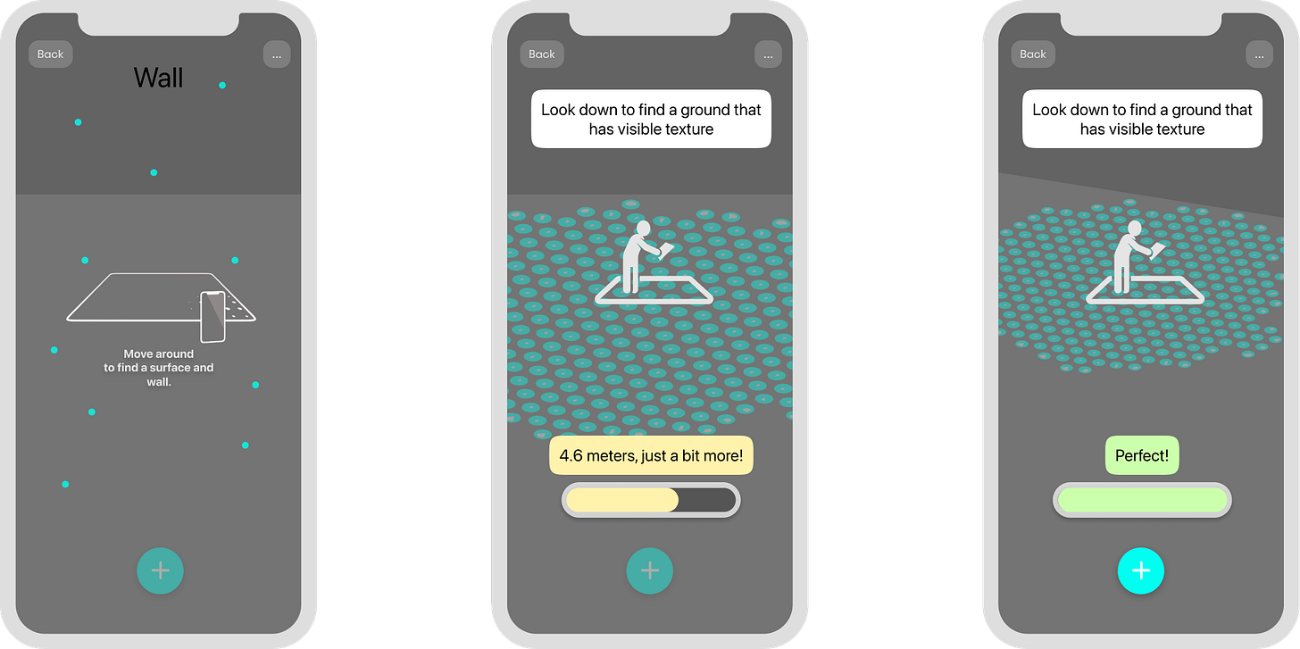
a) The user is prompted to move around and scan the environment around
b) As the user moves around we add a gamification method to know inform and incentivise users, in this case, a progress bar and charted scanned areas with a blue dot matrix. By this point, we have the option to let users pursue forward, or push them to go to the next step.
c) When done a button is turned on or the screen moves forward to the next step.
Playground Designs
Every design has a line with could the model be built in a field, usually it’s between the points that are the furthest away from each other and correlated to the start and end of the game, mostly to determine if there is enough space to play.
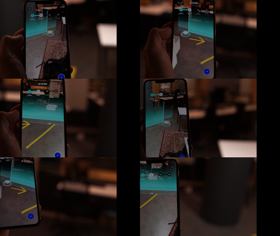
For our example we will take no3, to place the field which consists of a gate we need to place a line on a wall, which will demarcate the gate for the activity. We start by placing the first point, followed by a visual demarcation to show when we have enough space to place the second point.
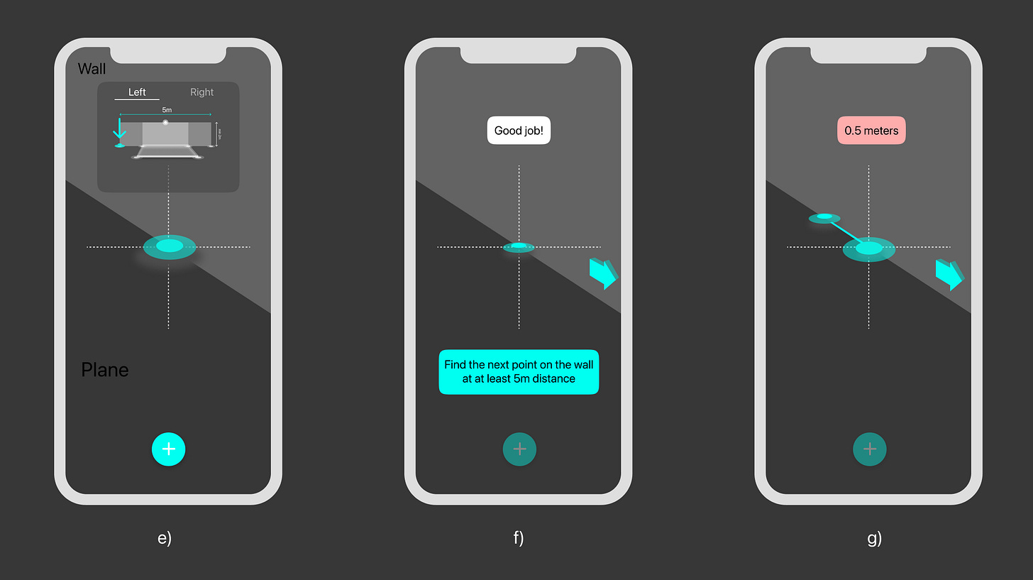
d) Placing the first point just at the edge of the wall. We have the option to switch the starting position from Left (Default) to Right (Left handed users).
e) Immediately we prompt the user to move the device further on the right
f) The line is dynamically measured showing the units in red until we have enough space
✷ Adjustments ✷
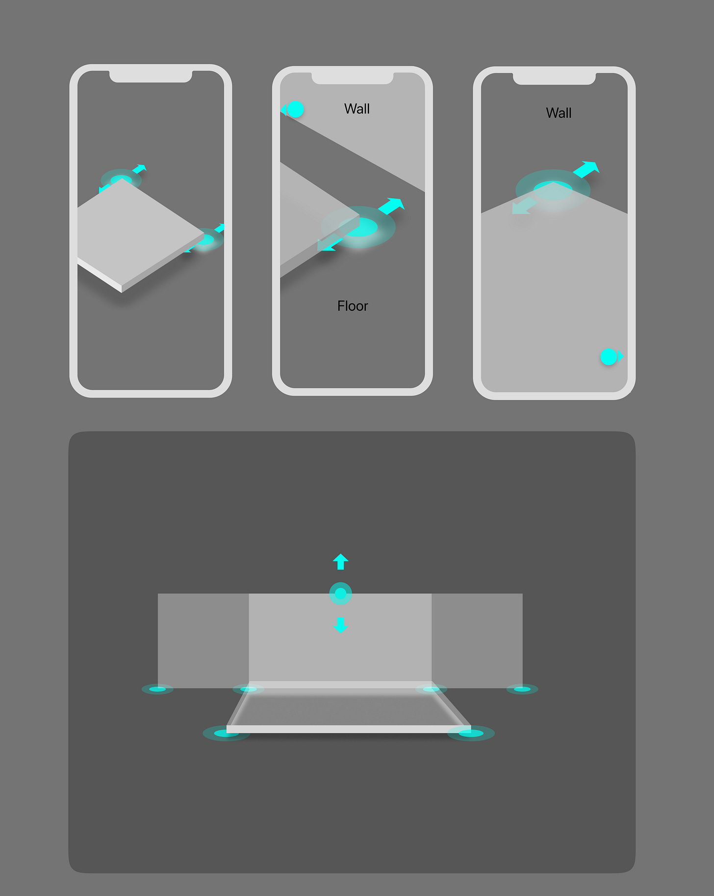
Every model will be either fixed or will require adjustments, some are entirely complementary or they‘re more like things to make sure about. In this case, if the field is close to the wall, offering options to adjust if needed or confirm to go to the next step.
Note the small “guide dots”? They appear when certain adjustment hotspots are not in view, and act like a compass to guide to the user around. Additionally, we can number steps or emphasise there are steps involved.
✷ Conclusions ✷
As I’m writing this article, Apple unveiled its Vision Pro headset that demarcates a moment when this new medium will become adopted for the masses. (Not only for professional or edge case specialist use)
Lots of the issues so far will be solved in the future, edge/wall detection, objects around, and interaction with other IoT devices will be solved through AI and computer vision.
Designing good UX for AR is mo mere different than good design in general, however, we need a set of new tools to make up for the new dimension. At another moment I use a series of tools like Torch, Shapr3d and tricks in Protopie, Framer and After Effects.


